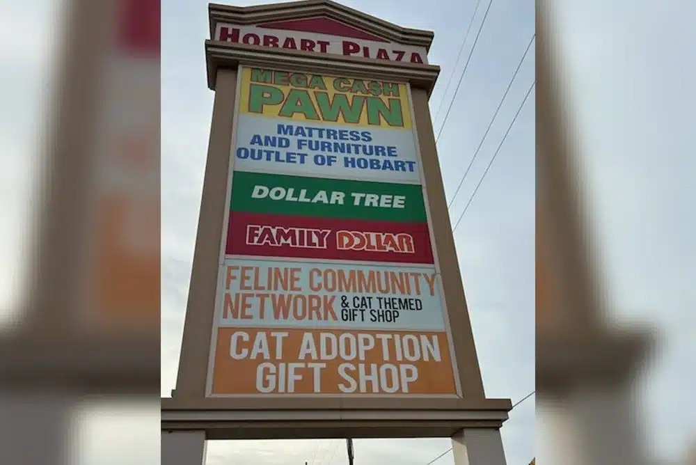
Investing in custom signage like banners or yard signs is one of the most cost-effective ways to advertise. But if your sign is too small, or the colors clash, you might as well be invisible.
The secret to highly effective signage is understanding the science behind legibility—how far away and how fast a driver can read your message.
Part 1: Calculating the Right Sign Size
The overall size of your sign must be driven by the height of the most critical text. This is determined by your required viewing distance, which is heavily influenced by traffic speed.
1. The Legibility Rule of Thumb
The standard rule for optimal legibility (reading with ease and without strain) is simple:
For every 10 feet of viewing distance, use 1 inch of letter height.
2. Factoring in Traffic Speed (Viewer Reaction Time)
You need to give a driver enough time to detect, read, and comprehend your simple promotional message. Industry standards recommend a minimum of 3 seconds of uninterrupted visibility.
Use this chart to determine the distance your sign must be readable from, and then apply the rule above to find your minimum letter height:
*Example: If your banner is on a busy road with a 45 MPH speed limit, your primary text should be at least 20 inches tall to ensure drivers have a full three seconds to process your message.
Part 2: Picking High-Visibility Colors
Color contrast is paramount—even a massive sign is worthless if the colors blend together at a distance.
The Science of Contrast: The Mandate
For maximum visibility, you must achieve a high contrast ratio (at least 65%) between the text and the background. This is achieved by pairing a light color on a dark background or a dark color on a light background.
Which Colors Do We See First?
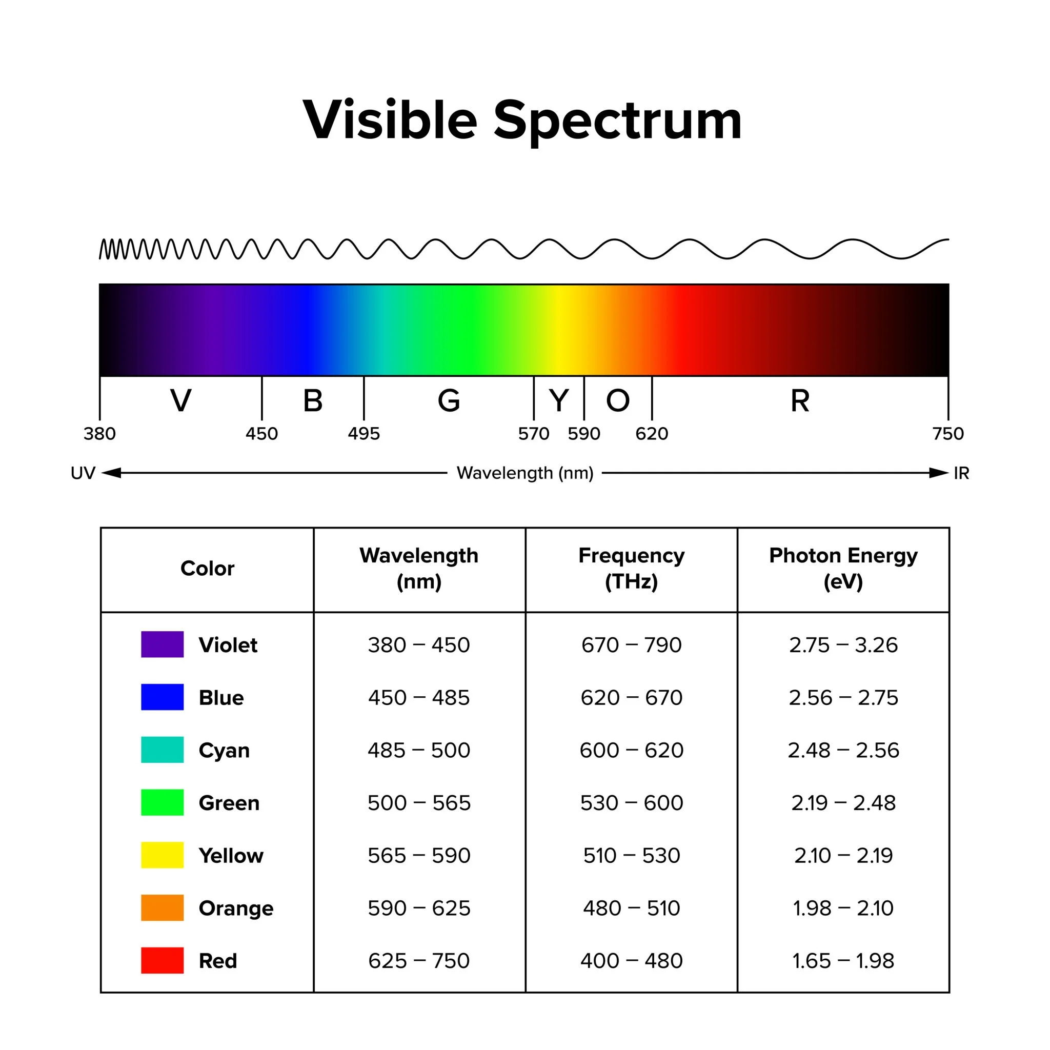
While contrast is key for legibility, certain colors are perceived faster by the human eye. Colors at the ends of the visible spectrum tend to be less visible than those in the center.
The colors the human eye is most sensitive to and perceives first are those with the highest visibility wavelength, which fall in the yellow-green portion of the spectrum.
- Yellow: The most visible color in the spectrum, making it an excellent background choice.
- Green: Highly visible, often used for directional signs (like highways) because of its calming effect combined with visibility.
- Red: While not the most visible, its association with danger and urgency makes it grab immediate attention.
This is why the Black on Yellow combination is consistently rated as one of the best for high-speed traffic—it combines the most visible background color (Yellow) with the highest contrast text color (Black).
Key Takeaway for Your Signage
- Measure and Calculate: Use the speed limit to determine the necessary letter height (1″ per 10 feet of required viewing distance).
- Contrast is King: Prioritize a high-contrast pairing like Black on Yellow or White on Black.
- Keep it Simple: Limit the sign to the absolute minimum text needed (e.g., “SALE,” “OPEN,” “50% OFF”) to maximize the time spent reading the message, not decoding it.
Ready to design a banner that truly stands out? https://wiseguysprinting.com/outdoor-signs/